Pick a High-End Color Palette That Feels Calm and Cohesive
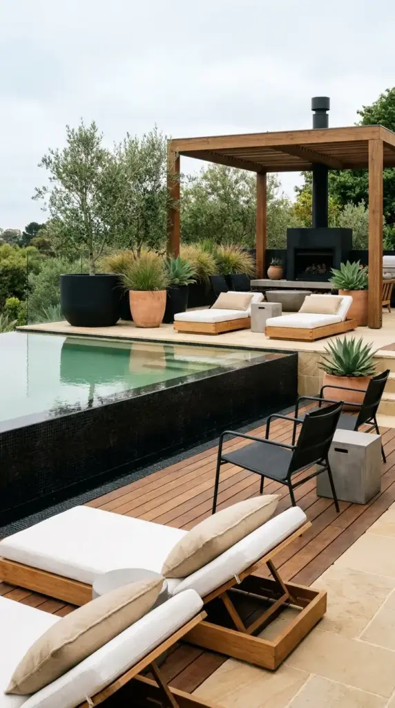
Stick to a resort-inspired palette
The easiest way to fake luxury is with color discipline. I like modern pool color palette combinations like black and wood, sand and white, or soft olive with warm stone.
These palettes feel timeless and work across lots of home styles. They also photograph beautifully, if that matters to you.
Repeat tones on purpose
Use the same two or three shades across decking, cushions, planters, fencing, and accessories. Repetition is what gives a space that polished designer look.
A black pool exterior or dark cladding can look incredibly sleek when balanced with lighter decking and greenery.
Let the water color guide you
Your liner, surrounding materials, and light all affect how the water reads. Pale surroundings often make the water look brighter blue, while darker finishes can create a moody, upscale feel.
I personally love a soft gray-and-wood combo. It feels current without trying too hard.
Avoid visual noise
Too many bright colors, trendy prints, and mixed finishes can pull the eye in ten directions. This is one of the biggest reasons some above ground pool with deck spaces still don’t feel elevated.
With your palette set, the next step is softening the edges with plants, so click the next button below because landscaping is where the resort illusion really settles in.
GIPHY App Key not set. Please check settings