Secret 6: Build a Simple Color Story
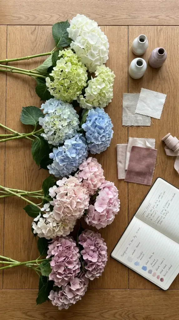
Pick a palette that feels intentional
The biggest difference between a random bunch and a designer flower arrangement is usually the palette. I choose one lane and stay in it.
Right now, softer tonal floral design is still very popular. Think white with green, blue with lavender, or blush with mauve instead of loud contrast everywhere.
Try easy color formulas
If you’re nervous, use one of these: monochromatic bouquet, tonal mix, or soft contrast. These formulas make budget flower arrangement styling look way more expensive.
Monochrome is the safest. Tonal is the prettiest. Soft contrast is great when your room needs a little lift.
Match the bouquet to your space
Look around your home decor before you arrange. If your kitchen is warm and earthy, a cool icy blue hydrangea mix may feel disconnected.
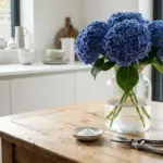
I like creamy white and green hydrangeas for neutral spaces, and dusty blue or mauve for moodier rooms. It helps the bouquet feel like part of the room, not a random guest.
Avoid the “every color in the bucket” trap
Grocery floral buckets tempt you to mix everything. Resist.
I’ve made that chaotic rainbow bouquet before, and it screamed “grabbed in a hurry” instead of romantic home decor flowers.
Color is handled, but now we need structure, because even gorgeous blooms can collapse without support, so hit the next button below for the mechanics that change everything.
GIPHY App Key not set. Please check settings