3. The Texture Contrast Power Play
I’ll never forget the day I realized all my plant pots had the exact same smooth, glossy finish. Everything looked so… flat and boring.
It was like eating vanilla ice cream for every meal. Technically fine, but where’s the excitement?
That’s when I discovered texture mixing could make my $15 Target pots look like expensive designer pieces.
Why Mixing Smooth and Rough Textures Works Magic
Here’s the thing about our brains – they crave visual interest and contrast. When everything in a space has the same texture, our eyes get bored and move on.
But mix a smooth ceramic pot next to a rough woven basket, and suddenly both pieces look more expensive and intentional.
It’s like the design equivalent of adding salt to chocolate – each element makes the other one better.
I started experimenting with this after seeing it in a fancy hotel lobby. They had sleek metal planters next to rustic wooden boxes, and the combination looked absolutely stunning.
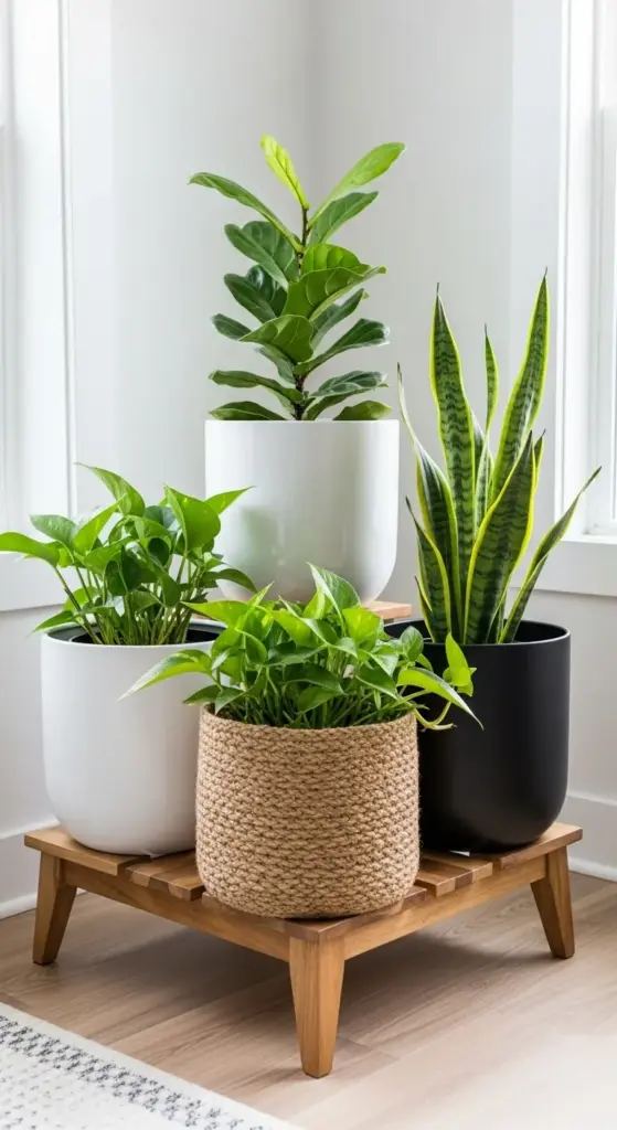
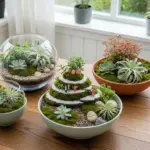
Smooth textures (ceramic, glass, metal) feel modern and clean. Rough textures (woven materials, natural wood, stone) add warmth and organic appeal.
The contrast between these opposites creates what designers call tactile tension – your eye wants to keep looking because there’s always something new to discover.
The Three-Texture Rule That Prevents Chaos
Okay, so I got a little carried away with this texture thing at first. I had smooth pots, rough baskets, bumpy ceramic, woven covers, metal stands, and wooden trays all in one corner.
It looked like a craft store had exploded in my living room.
That’s when I learned the three-texture rule from a design blog. Pick three different textures maximum for any plant display area.
For example: smooth white ceramic + rough jute rope + matte black metal. That’s it. No more additions allowed.
This rule forces you to be intentional instead of just collecting every interesting texture you see.
One smooth, one rough, one in-between works perfectly. The middle texture acts like a bridge between the extremes.
I use this formula religiously now, and my plant displays always look cohesive instead of chaotic.
Incorporating Natural Materials Without Looking Rustic
This was tricky for me because I live in a modern apartment, not a farmhouse. I wanted natural textures without the country cabin vibe.


Sleek wooden planters with clean lines work great. Think mid-century modern style rather than barn wood.
Smooth river rocks as pot toppers add natural texture without screaming “rustic.” Way better than those chunky bark pieces.
The key is choosing natural materials with refined finishes.
Polished stone pots give you that organic feel with sophisticated appeal. Woven baskets in neutral colors add texture without looking too casual.
I avoid anything that looks handmade or deliberately weathered. Clean, simple natural materials blend perfectly with modern decor.
Budget-Friendly Texture Tricks
Here’s where I got creative because buying all new textured pots wasn’t happening on my budget.
Rope wrapping transformed my boring plastic pots instantly. Just hot glue some jute rope around the outside – takes 10 minutes and costs under $5.
Textured spray paint works magic on smooth surfaces. I used stone-texture spray on some old ceramic pots, and they look like expensive concrete planters now.
Pot covers became my secret weapon for instant texture changes.
Woven baskets from thrift stores make perfect pot covers. Drop your plastic pot inside, and boom – instant texture upgrade for $3.
Macrame plant hangers add texture vertically. I learned basic macrame from YouTube videos and made three hangers for the cost of one store-bought version.
Natural materials from outside work too. I collected smooth stones from a beach trip and use them as decorative pot toppers.
Fabric pot wraps using burlap or linen scraps create temporary texture changes. Perfect for seasonal switches without permanent commitment.
The best part about these DIY texture solutions? You can experiment without major investment.
If something doesn’t work, you’re only out a few dollars and some time.
Ready to discover the mathematical formula that makes plant groupings look professionally arranged? The next section reveals the “triangle method” and spacing secrets that interior designers use to make small spaces look bigger – click below to learn the strategic grouping technique!
GIPHY App Key not set. Please check settings