2. The Color Psychology Pot Pairing Method
I used to think plant pots were just containers. Boy, was I wrong about that assumption.
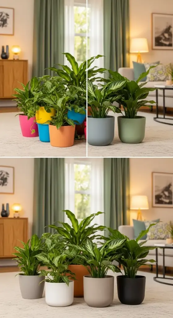
My first apartment looked like a rainbow exploded in a garden center. Bright blue pots next to hot pink ones, with some random yellow thrown in for “fun.”
It was absolutely chaotic and gave me a headache every time I walked in.
Interior Designers’ Secret Color Wheel Strategy
Here’s what changed everything for me. My neighbor, who’s an interior designer, showed me this color wheel technique that professionals use but never talk about publicly.
She explained that warm colors (reds, oranges, yellows) make spaces feel cozy and energetic. Cool colors (blues, greens, purples) create calm and relaxing vibes.
But here’s the kicker – you don’t want your pots fighting with your room’s energy.
If your living room already has warm wood tones and cozy lighting, adding bright orange pots creates sensory overload. Instead, you want complementary colors that enhance the existing mood.
I started using this simple rule: identify your room’s dominant color temperature first, then choose pot colors that either harmonize or provide gentle contrast.
Making Your Plants the Star (Not Your Pots)
This was my biggest “aha” moment. I was so focused on finding cute pots that I forgot the plants should be the main attraction.
Neutral pot colors became my best friend after this realization. Think soft whites, warm grays, natural terracotta, and matte black.
These colors act like a picture frame – they enhance what’s inside without stealing the spotlight.
I learned this lesson after buying these gorgeous turquoise pots that completely overwhelmed my delicate ferns.
The plants looked like afterthoughts in their own containers. Now I save bold colors for accent pieces only.
Terracotta pots work magic with green foliage. The warm clay color makes every shade of green pop like crazy.
White and cream pots are perfect for colorful plants like crotons or flowering varieties. They provide a clean backdrop that lets the plant colors shine.
The Accent Pot Rule That Changes Everything
Okay, this rule literally transformed my entire space. Here’s how it works: choose one accent color that appears somewhere else in your room.


Maybe it’s the throw pillows on your couch, or a piece of artwork, or even your coffee table books.
Then use that exact color in just one or two plant pots maximum.
I have sage green curtains in my living room, so I use sage green pots for my two statement plants. Everything else stays neutral.
This creates what designers call visual cohesion – your eye travels around the room and sees connections everywhere.
The 80/20 rule works perfectly here. About 80% of your pots should be neutral, and 20% can be your accent color.
Seasonal Color Switching for Year-Round Appeal
This strategy came from pure laziness, honestly. I got tired of my space looking the same all year long.
Spring and summer: I swap in lighter, brighter pot colors. Soft pastels, crisp whites, and fresh greens make everything feel airy.
Fall and winter: Deeper, richer tones take over. Warm browns, deep grays, and matte black create that cozy seasonal vibe.
The trick is having a storage system for your off-season pots.
I use clear plastic bins in my closet, labeled by season. Takes about 30 minutes twice a year to completely refresh my plant display.
Seasonal plant swaps work great too. Summer succulents in bright pots get replaced by winter evergreens in darker containers.
This approach keeps your space feeling fresh without buying new plants constantly.
The best part? Guests always comment on how “put together” everything looks, even though I’m just following these simple color psychology principles.
Ready to learn about the texture contrast technique that makes cheap pots look expensive? The next section reveals the “three-texture rule” that interior designers swear by – click below to discover how mixing smooth and rough surfaces creates that high-end look!

GIPHY App Key not set. Please check settings