5. Color Palette Mastery for Boho Vibes
I’ll be honest – my first attempt at creating a boho color palette looked like a crayon box exploded on my patio. I thought boho meant “throw every bright color together and hope for the best.”
The result was absolutely chaotic and gave me a headache every time I stepped outside.
It took me three complete patio makeovers to understand that boho color palettes aren’t about using every color in the rainbow – they’re about creating harmony with intentional color choices. Now my space feels cohesive and calming instead of overwhelming.
Earth Tones and Jewel Accents That Work
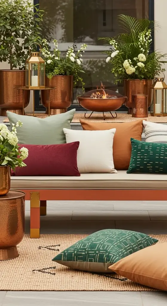
Warm earth tones became my foundation after I realized they’re what make boho spaces feel grounded and peaceful. Think terracotta, warm browns, sage greens, and creamy off-whites.
I start every color scheme with these neutral earth tones as my base – about 70% of my color palette comes from this family.
Then I add jewel tone accents sparingly. My current favorites are deep emerald green, rich burgundy, and burnt orange. These colors pop beautifully against the neutral base without overwhelming the space.
The mistake I used to make was using jewel tones as dominant colors instead of accents. Now I limit bold colors to about 20% of my overall palette.
My throw pillows, small planters, and artwork carry the jewel tones while my larger furniture pieces stick to the earth tone foundation.
Metallic Magic with Brass and Copper
Metallic accents were the missing piece that elevated my entire patio from amateur to professional-looking. I was scared of mixing metals at first, thinking everything had to match perfectly.
Brass and copper are absolute game-changers for boho spaces. These warm metals complement earth tones beautifully and add that luxurious touch without feeling too fancy.
I incorporate brass through my lighting fixtures, plant pot accents, and decorative objects. My copper elements include planters, wind chimes, and a gorgeous fire bowl that’s become my centerpiece.
The key is keeping your metal finishes in the same warm family – brass, copper, and bronze all work together beautifully. Avoid mixing these with cool metals like chrome or silver.
I aim for about 10% metallic accents throughout my space. Too much and it becomes overwhelming, too little and you miss that magical sparkle factor.
Balancing Bold Patterns with Neutrals
This is where I see most people go wrong with boho pattern mixing. I used to think more patterns meant more boho, but I created visual chaos instead of stylish eclectic charm.
The secret is the 80-20 rule for patterns. Eighty percent of your textiles should be solid colors or very subtle patterns, with only twenty percent being bold, eye-catching designs.
I use neutral solid cushions as my base, then add one or two pillows with bold geometric or floral patterns. My area rug has a subtle pattern that doesn’t compete with my accent pieces.


When mixing patterns, stick to the same color family. My bold patterns all include at least one color from my earth tone base palette.
Scale matters too. If you have one large-scale pattern, balance it with smaller-scale patterns or solids. I learned this after putting two large floral patterns together and creating a visual nightmare.
Seasonal Color Transitions Made Easy
Seasonal color changes keep my patio feeling fresh year-round without requiring a complete overhaul. I used to think I needed different furniture for each season until I discovered the power of strategic accent swapping.
My base palette stays the same all year – those warm earth tones work in every season. I just change my accent colors with removable elements.
Spring brings soft lavender and fresh green accents through new throw pillows and small planters. Summer gets brighter with coral and sunny yellow touches.
Fall is my favorite – I swap in deeper burgundy and burnt orange accents that make the space feel cozy. Winter calls for richer jewel tones and maybe some deep navy blue elements.
The trick is storing seasonal accents in labeled bins. I can transform my entire patio’s mood in about 30 minutes just by swapping pillows, throws, and small decorative objects.
Paint Techniques That Transform Everything
Furniture painting became my secret weapon for creating a cohesive color palette on a budget. I’ve transformed mismatched thrift store finds into pieces that look like they were designed together.
Chalk paint is absolutely magical for outdoor furniture. It adheres to almost any surface and creates that perfect matte finish that screams boho chic.
My go-to technique is color washing – applying a base coat, then dry-brushing a slightly different shade over it for depth and texture. This works especially well on wooden pieces.
For metal furniture, I use spray paint in my signature earth tones. A$15 can of terracotta spray paint transformed my boring black bistro set into a stunning focal point.
Don’t be afraid to paint just parts of pieces – I painted only the legs of my wooden bench in brass metallic paint while leaving the seat natural wood. The contrast is gorgeous.
The key is choosing 2-3 paint colors that work with your overall palette and using them consistently across different pieces. This creates unity even when your furniture comes from different sources.
Your color palette is now perfectly balanced and absolutely stunning, but let’s talk about the finishing touches that make your space feel uniquely yours. Click “next” to discover the accessory styling secrets that transform a pretty patio into a space that tells your personal story – including the one mistake that makes spaces look like showrooms instead of homes!

GIPHY App Key not set. Please check settings