Secret #4: The “Color Blocking” Method

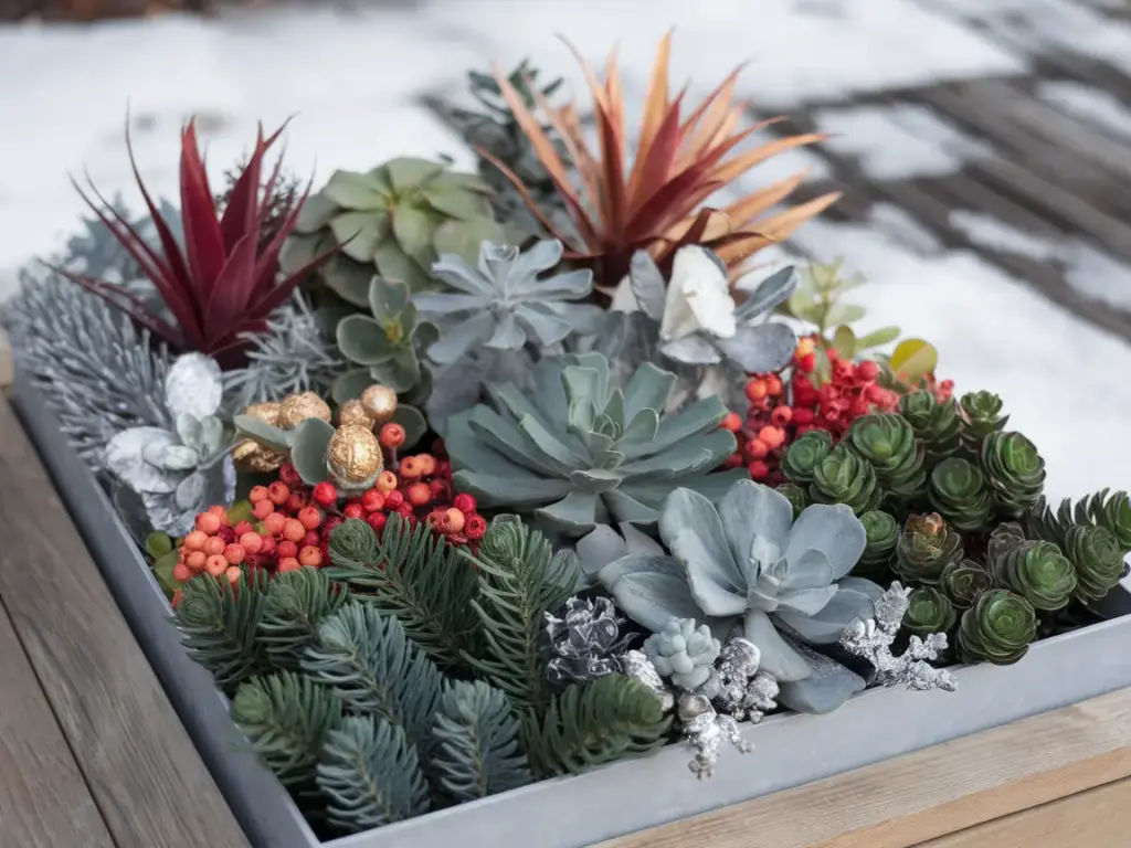
I’ll never forget the winter I created what I thought was a perfectly balanced planter, only to have my designer friend point out that it looked “muddy.” That’s when she introduced me to the professional color blocking method that completely transformed my winter container designs.
The Magic of 30-30-30-10
After years of trial and error, I’ve discovered that professional designers use a specific color ratio that works every single time. Here’s the breakdown of my foolproof formula:
- 30% deep greens (spruce, pine, cedar)
- 30% silvery or frosted elements
- 30% warm accent colors (red, gold, or copper)
- 10% unexpected “pop” color
This ratio creates perfect balance while maintaining visual interest throughout the season.
The Power of Three
You know what’s funny? I used to arrange everything in pairs until I learned about the odd-number rule. Here’s why it works:
- Groups of Three:
- Create natural focal points
- Force asymmetrical design
- Lead the eye through the arrangement
- Five-Element Clusters:
- Perfect for larger containers
- Allow for depth building
- Create professional-looking layers
- Seven-Item Groupings:
- Ideal for grand displays
- Enable multiple viewing angles
- Create stunning visual impact
Strategic Color Placement
Let me share my zone-based color placement strategy that guarantees eye-catching results:
Bottom Zone:
- Darkest evergreen varieties
- Silver-toned elements
- Natural wood tones
Middle Zone:
- Lighter green varieties
- Bright berries or pods
- Frosted elements
Top Zone:
- Your “pop” color
- Metallic accents
- Statement pieces
Colors That Pop Against Snow
Here’s something that surprised me – the colors that look best against snow aren’t always what you’d expect! These are my tried-and-true winners:
- Unexpected Winners:
- Deep purple (not traditional red!)
- Chartreuse
- Copper metallics
- Navy blue
- Bright orange
- Avoid These:
- Pure white (gets lost)
- Pale yellow
- Light pink
Professional Color Combinations
After designing hundreds of winter planters, these are my go-to color schemes:
- Modern Winter:
- Charcoal grey
- Silver
- Ice blue
- 10% lime green pop
- Traditional Plus:
- Forest green
- Burgundy
- Copper
- 10% purple pop
- Nordic Inspired:
- Blue-green
- White
- Natural brown
- 10% orange pop
The Contrast Secret
Here’s my professional trick for making colors truly stand out:
- Always place bright elements against dark backgrounds
- Use silver elements to separate competing colors
- Create depth with color gradients
- Position warm colors in front of cool ones
I learned this the hard way after creating a planter that completely disappeared into its background!
Ready to take your winter planter from day to night? In Secret #5, I’ll reveal my “Layered Lighting Technique” that creates magical evening displays. Plus, I’ll share my battery-powered lighting tricks that keep your display glowing all season long without running up your electric bill! Click next to illuminate your winter planter game.


GIPHY App Key not set. Please check settings