Step #2: Plan Your Color Palette
Choosing the right colors for your cut flower garden is like picking out an outfit—you want it to reflect your personality and vibe with your surroundings. I’ll admit, I’ve gone overboard with random colors in the past, only to end up with a chaotic mess that clashed with my home’s aesthetic. Let’s avoid that together, shall we? Here’s how to plan a color palette that’s as intentional as it is beautiful.
Start with Your Personal Style
Your garden should feel like an extension of you, so start by thinking about your personal style. Are you into soft, muted tones, or do you prefer bold, eye-catching hues? Personally, I lean toward pastels because they remind me of spring mornings and lavender lattes—so calming.
If you’re unsure where to begin, take a cue from your wardrobe. Do you gravitate toward neutrals like beige and white, or are you all about those jewel tones? One year, I matched my garden to my favorite summer dress—a mix of blush pink, peach, and cream—and it was chef’s kiss. Matching your garden palette to your wardrobe isn’t just fun; it’s a great way to create cohesion between your indoor and outdoor spaces.
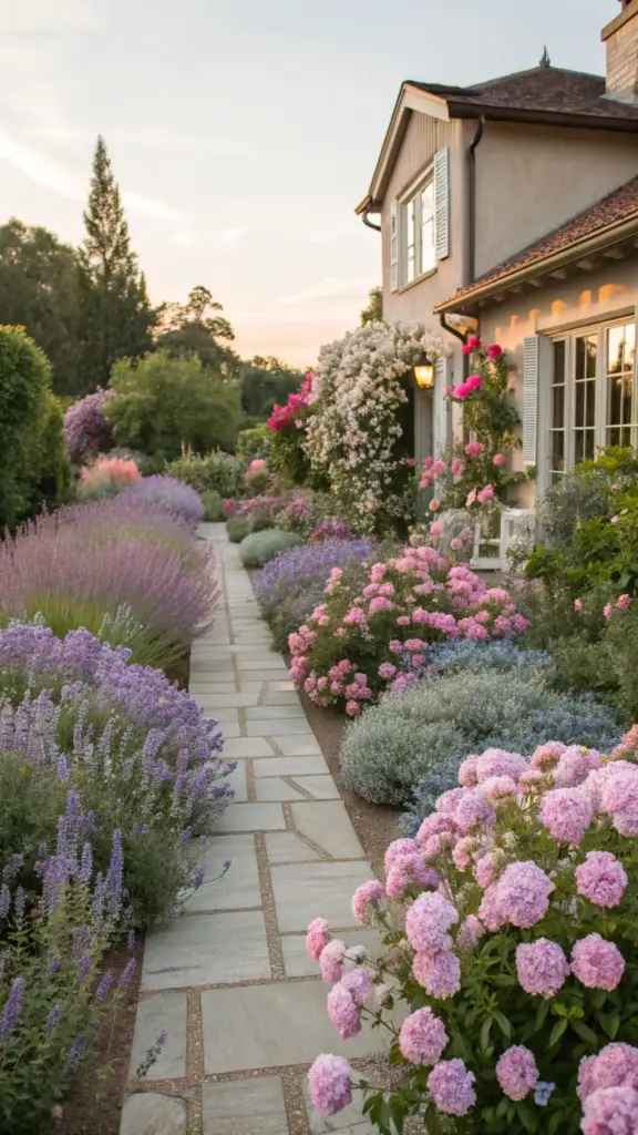
Pastels for Soft Elegance
If you’re aiming for a serene, elegant look, pastels are your best friend. Think soft pinks, baby blues, and creamy yellows. These colors work beautifully in small spaces, like urban balconies or cozy patios, because they don’t overwhelm the eye.
One of my favorite combinations is dusty pink zinnias paired with white cosmos and silver foliage like dusty miller. It’s subtle yet stunning, kind of like wearing a cashmere sweater with pearl earrings. For inspiration, check out art movements like Impressionism—Monet’s water lilies practically scream “pastel garden goals.”
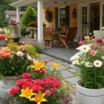
Bold Hues for Dramatic Flair
On the flip side, if you’re all about making a statement, go bold! Vibrant reds, oranges, and purples can turn your garden into a living piece of abstract art. A few years ago, I planted a fiery combo of scarlet zinnias, orange marigolds, and purple salvia, and it felt like stepping into a Frida Kahlo painting.
Pro tip: Use the color wheel to guide your choices. Complementary colors (like purple and yellow) create contrast, while analogous colors (like blue, purple, and pink) offer harmony. This is straight-up design 101, but it works wonders in gardens too.


Tie It Into Fashion and Beauty Trends
Here’s a fun thought: What if your garden could double as your beauty mood board? Lately, I’ve been obsessed with the “cottagecore” trend—it’s all about soft florals and vintage vibes. So, I planted a mix of lavender, baby’s breath, and peach roses to channel that aesthetic.
Or, if you’re into bold makeup looks (hello, neon eyeliner), try planting electric hues like magenta dahlias or sunny sunflowers. Your garden can be just as trendy as your lipstick collection—I promise!
Examples of Color Combos Inspired by Art
For a modern twist, try a monochromatic scheme. Picture rows of pink snapdragons, blush peonies, and rose-colored asters—it’s minimalist but still packed with personality. Or, if you love the drama of abstract art, mix unexpected colors like deep burgundy dahlias with lime green foliage.
Another favorite of mine? A coastal-inspired palette of blues and whites. Think blue delphiniums, white daisies, and silvery artemisia. It’s fresh, clean, and perfect for mimicking that beachy vibe—even if you’re miles from the ocean.
Excited to bring your color palette to life? Click the “next” button below to discover which easy-to-grow annuals will make your vision a reality. Spoiler: They’re practically foolproof! 🌸


GIPHY App Key not set. Please check settings